Making Design Easy: Four Principles to Help Non-Designers Part 4 - Proximity

Welcome to the grand finale of our design principles for non-designers series! it’s based on Robyn Williams’ excellent book, The Non-Designer’s Design Book and whether you're an entrepreneur ready to elevate your brand or a newcomer excited to delve into the world of design, its principles can help you polish up your templates from plain to pretty perfect!
We started this series with a simple goal: to demystify the world of design, and show that anyone with passion and the right guidance can create visually compelling designs.
Today, we're diving into our final principle, Proximity - an often overlooked but vital concept that can give your printable more clarity so that they’re easy to read and follow.
The Non-Designer's Guide to Customising Your ClickSell Studios Template: Proximity
Proximity is so simple, you probably already do it it - it’s about grouping related items together. It’s a way of organising your content that helps guide the viewer's understanding. It's like placing all the ingredients for a recipe together on a kitchen counter - it's clear they're all part of the same dish.
Let's delve a bit deeper into this concept.
1. Grouping Elements – Form Follows Function
When we group related elements together, it helps users intuitively understand how they connect with each other.
For example, suppose you're creating a 'Meet the Team' section on your website. By placing a team member's photo, name, and bio together, you create a clear, visual 'unit' that helps users instantly understand that these elements are related.
This visual association is much stronger than if these elements were scattered randomly across the page. As we said - you probably already do this and you definitely see it everywhere. Now you know what it’s called.
Logical, right?
2. Separating Different Sections – Give Space to Breathe
While grouping related elements is crucial, it's equally important to separate different sections.
Think of it as placing invisible walls in an open space - they guide your audience from one space (or topic) to the next without confusion.
For example, on a blog page, keeping a clear space between different posts can make it much easier for your readers to distinguish where one article ends and the next one begins.
It's the visual equivalent of a pause in a conversation - it gives your audience time to digest what they've seen before moving on to the next point.
3. Proximity in Text – Clarity in Communication
Proximity isn't just about images or sections - it's also vital when it comes to text.
Grouping related points or ideas together in paragraphs helps guide the reader through your content. It’s what our teachers drummed into us all through school.
Imagine you're writing about two different products on your e-commerce site. If you mix information about both products in a single paragraph, it might confuse the reader.
But by grouping all the information about each product in separate paragraphs, it's clear which details relate to which product.
This makes your content much easier to digest and understand.
4. Proximity Meets Alignment, Repetition, and Contrast
Good design isn't about mastering one principle at a time It is about creating harmony between all the principles.
Used with alignment, repetition, and contrast, proximity can help make your designs clearer, more engaging, and more intuitive.
In practice, this means you align related elements that share a similar design or style (repetition) that clearly stand out from other elements (contrast), and are grouped together (proximity) to create a design that is not only visually appealing but also easy to understand.
Wrap up
With that, we wrap up our exploration of the principle of proximity and our design principles series.
We hope that you’ll try to apply these concepts to your ClickSell Studios templates. They can take your designs from good to pretty bloody good - and definitely to ‘good enough’.
Despite the topic of this series, we want you to remember this:
Content is king
So having great information that is easy to read is your biggest selling point. So your designs only need to be good enough:
easy to read with enough space between lines and topics
logically grouped
enough places for your reader’s eyes to rest
and ideally, not so colourful that they use a whole tank of ink in the printing.
So keep experimenting, keep creating, and continue to bring your unique vision to life with your ClickSell Studios templates.
We can't wait to see where your design journey takes you next.
Create Winning Digital Products with our FREE Tool Kit!
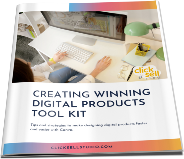
Enter your name and best email addie >>> and we'll send you our subscriber-only Tool Kit. It's packed with amazing resources and information to get you creating in Canva fast. And, every time we email you'll receive a great discount coupon for our new products.
Browse our Templates
Discover tools designed for your success! From customisable cards to templates designed to add high quality products to your business, our collection is tailored for coaches, entrepreneurs, and resellers. Explore now and find the perfect fit for you.
Elevate your Printables Business: Productivity Power-Up Course
for your most productive week yet
Unleash your potential with Productivity Power Up: A one-hour, value-packed course offering a synergy of tools to streamline your entrepreneurial journey, all for just $9 (valued at $37).
Financial Wellness Prompted Journal and Tracker
Unlock the power of financial wellness with our customizable Journal Template, the ultimate tool for coaches and resellers that offers a valuable mix of affirmations, visualization exercises, and practical guidance to help foster prosperity and growth.
Abundance Guided Journal Canva Template for Commercial Use
Kickstart your passive income journey with our customizable Gratitude Journal Editable Canva Template, designed to save you time while offering a beautifully prepopulated journal filled with gratitude prompts and reflections across over 50 pages.
0 comments
Leave a comment