Making Design Easy: Four Principles to Help Non-Designers Part 2 - Repetition
We're back with the second helping of our article on four basic principles of design, as taught by Robin Williams in her book, The Non-Designer's Design Book. The first post in the series was on Contrast, so if you haven't read that yet, take a look first. If you have seen it already, thank you for continuing this journey with us.
Why we're doing this series
It's part of our commitment to helping you succeed in your business by using our templates as your starting point for creating your own unique products. The better and faster you are at customising our templates, the more products you can offer your own customers.
Our mission is to help people make the most of life by supporting them in mind, body and spirit. We're just two people but you help by re-creating our work in your own style, and spreading the wellbeing, confidence and joy that our templates can help spark in others.
We're bringing you these simple but essential design principles that can help you create great products, regardless of your experience.
Why repetition matters
When I first read this book back in the 90s, so much of what she taught made me go 'oh of course' because you'll see these principles in every ad, TV show, even in Ikea when you're shopping. They just make sense because they work with our brains. Our human brains like consistency!
Repetition is everywhere - from the old communications theory that you have to tell people something 3-4 times (some now say 7!) before they'll take the action you want, to your mum telling you to clean up your teenage bedroom, we need to hear things a few times.
We also need to see things a few times. In design, this means repeating elements to create a sense of unity, consistency, and cohesiveness.
The repeated elements could be:
Colors
Shapes
Textures
Images
Page structures
Spatial relationships
Even line thicknesses.
Let's break down how you can incorporate repetition into your ClickSell Studios template.
Consistent Colors – Harmony in Hues
One of the simplest ways to create consistency in your template is by repeating colours.
For example, if you're using a particular shade of blue in your headline, try using the same shade somewhere else as well, like in a table border or bullet points. This creates a sense of continuity and harmony throughout the template.
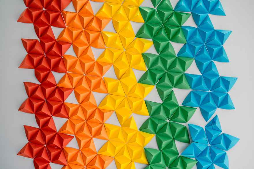
Patterns and Shapes – The Beauty of Geometry
Repeating shapes or creating patterns can also bring unity to your design.
This could be as simple as using the same shape for all your bullet points, or as complex as creating a background pattern with repeated geometric shapes or even using the same shapes in your page background
Repetition guides the reader's eye and creates a sense of rhythm.
Typography – Repeating Fonts and Styles
Repeating typefaces or font styles can help guide the reader through your printable. Fonts help to create a visual hierarchy that builds a structure into your page. Vast forests have been felled in the name of discussing fonts, typefaces and visual hierarchy, but we're not doing that here.
The main point is this:
Use one font for your heading
The same one for sub-headings, smaller than the heading, or a different weight (for example, bold)
Use a different font for the body text
Keep doing that every page
Align with Alignment – Repeat Spatial Relationships
Repeating spatial relationships can also help create unity in your design. Sounds complex right?
It means - the spacing between and around different elements on your page.
So it could be that all text is left aligned - repeat that on every page - don't jump between fully justified text and left aligned
Or it could be how close your heading is to your body text.
Or how much space it between your table and the text above and below it. Keep it the same, or very similar, from page to page.
Consistent alignment creates a clean, professional look that appeals to the viewer's eye.
Mixing It Up: Repetition with Variety
So, using similar fonts, elements and spacing is important, it's also important that it's not all soooo consistent that your reader gets bored!
Repetition brings unity, but you must balance it with some variety to keep the design interesting.
Mix in some contrasting elements or introduce subtle changes in the repeated elements.
Repetition is to design what location is to real estate
Okay I have no idea if it really is, but I kept hearing 'location location location' in my head as I was writing this, and turning it into repetition, repetition, repetition.
Because hopefully you understand a little more about why repetition is important, and why you should also mix things up a little, you can apply this principle to your design work in Canva. So you're another step closer to transforming your ClickSell Studios templates into beautiful, easy to use and high quality designs that are YOU.
And next:
Up next in our series, we're tackling the design principle of Alignment. We'll be discussing how you can strategically place elements on your template to create a visual connection and enhance the overall look and readability of your design. Join our newsletter (below) to get the heads up for the next post.
Create Winning Digital Products with our FREE Tool Kit!
Enter your name and best email addie >>> and we'll send you our subscriber-only Tool Kit. It's packed with amazing resources and information to get you creating in Canva fast. And, every time we email you'll receive a great discount coupon for our new products.
Browse our Templates
Discover tools designed for your success! From customisable cards to templates designed to add high quality products to your business, our collection is tailored for coaches, entrepreneurs, and resellers. Explore now and find the perfect fit for you.
Elevate your Printables Business: Productivity Power-Up Course
for your most productive week yet
Unleash your potential with Productivity Power Up: A one-hour, value-packed course offering a synergy of tools to streamline your entrepreneurial journey, all for just $9 (valued at $37).
Financial Wellness Prompted Journal and Tracker
Unlock the power of financial wellness with our customizable Journal Template, the ultimate tool for coaches and resellers that offers a valuable mix of affirmations, visualization exercises, and practical guidance to help foster prosperity and growth.
Abundance Guided Journal Canva Template for Commercial Use
Kickstart your passive income journey with our customizable Gratitude Journal Editable Canva Template, designed to save you time while offering a beautifully prepopulated journal filled with gratitude prompts and reflections across over 50 pages.
0 comments
Leave a comment