Making design easy: Four Principles to Help Non-Designers - Part 1

Welcome to the era of design democracy where anyone can become a design superstar by learning four simple but profound principles.
We believe in your potential and ability to turn our white-label templates into something that’s uniquely yours, that’s a great fit for your audience and your brand - whatever your background or design experience.
That's why we're thrilled to introduce the first part of our four-article series based on Robin Williams’ excellent book, The Non-Designer's Design Book. Our aim is to empower you with the knowledge to turn your ClickSell Studios templates into high-impact digital products.
We're starting with the mighty principle of Contrast. So, whether you're a savvy entrepreneur or a passionate hobbyist, let's take a step into the world of design together and see how it can elevate your business and digital presence.
No need for a design degree or advanced software, as we're exploring this principle using ClickSell Studios templates and our favourite cross-browser and user-friendly platform, Canva.
Buckle up and let's make your designs pop!
The Non-Designer's guide to Customising your ClickSell Studios Canva Template: Contrast
Contrast is a striking design principle that helps you lead your reader’s eye where you want to it go. It’s all about making your page more readable.
But how can you use contrast effectively and strategically in your designs? How can it change your white-label ClickSell Studios template from 'meh' to 'marvelous'? Let's find out.
The Color Wheel – Creating Contrast with Colors
Color is a great place to start when discussing contrast.
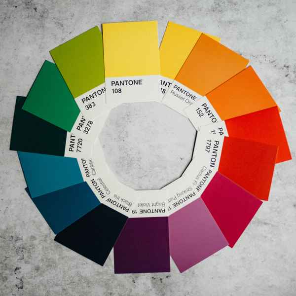 The color wheel can be your best friend here. Colors that are opposite each other on the wheel, known as complementary colors, create high contrast when paired together. Imagine a bright yellow background with a deep purple text on your ClickSell Studios template.
The sharp contrast not only makes the content stand out but also enhances readability.
Canva provides an easy way to experiment with these color combinations in your templates, and you'll see the transformation right before your eyes.
Size Matters – Using Different Element Sizes
Size is another powerful tool when creating contrast.
Larger, bolder elements draw attention, leading the viewer's eye.
Let's say you have a catchy tagline, a prominent logo, or a compelling call-to-action that you really want people to notice.
Making it larger or bolder than the other elements can create an effective contrast, adding weight and importance so that their eye travels there naturally.
Texture and Shape – Creating Depth and Interest
Different textures and shapes in your design is another smart way to create contrast.
This can add depth to your template, creating a layered and engaging design.
Try a rough texture - like a highly textured background with a smooth single tone box to hold your title. Or a geometric shape next to a more organic one.
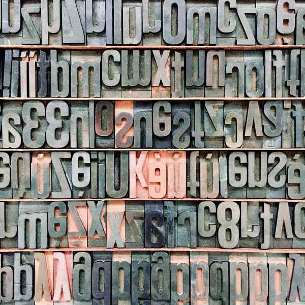 Typefaces – Contrasting Fonts for Emphasis
So this is a big one that we’ll mention a few times in this series. There are rules for how many typefaces you should use in any document, because when you use too many of them you’ll end up making a visual mess disaster headache nightmare (It’s the best word I can come up with - hey, it’s Friday!). Do read the whole series so you’ll understand more about typefaces as you go through, but for now keep it to no more than two.
You can use contrasting typefaces to create a visual hierarchy and add visual interest to your design. Try pairing a bold, sans-serif font for your headings with a light, serif font for your body text.
This can make your headings stand out, and guide the reader through your content.
Double Down: Mixing and Matching for Maximum Impact
Contrast doesn't have to be one-dimensional!
Try mixing different types of contrast:
color
size
texture
typeface
to create a unique and layered design. Combine a large, bold headline in a sans-serif font with a smaller, light sub-heading in a serif font. Use contrasting colors for your text and background.
The key is to experiment and have fun with your designs.
That’s a Quick Intro to Contrast in Your Design Work
Quick, but hopefully making you think and see your designs differently! Hopefully you feel ready to experiment with contrast to make your ClickSell Studios templates truly your own.
But this is just the beginning. In the next article in our series, we'll be exploring the seond principle: Repetition.
We'll show you how repeating certain elements can create a sense of unity and consistency in your designs.
You won't want to miss how these simple repetitions can take your designs to a whole new level. See you in the next article!
Create Winning Digital Products with our FREE Tool Kit!
Enter your name and best email addie >>> and we'll send you our subscriber-only Tool Kit. It's packed with amazing resources and information to get you creating in Canva fast. And, every time we email you'll receive a great discount coupon for our new products.
Browse our Templates
Discover tools designed for your success! From customisable cards to templates designed to add high quality products to your business, our collection is tailored for coaches, entrepreneurs, and resellers. Explore now and find the perfect fit for you.
Elevate your Printables Business: Productivity Power-Up Course
for your most productive week yet
Unleash your potential with Productivity Power Up: A one-hour, value-packed course offering a synergy of tools to streamline your entrepreneurial journey, all for just $9 (valued at $37).
Financial Wellness Prompted Journal and Tracker
Unlock the power of financial wellness with our customizable Journal Template, the ultimate tool for coaches and resellers that offers a valuable mix of affirmations, visualization exercises, and practical guidance to help foster prosperity and growth.
Abundance Guided Journal Canva Template for Commercial Use
Kickstart your passive income journey with our customizable Gratitude Journal Editable Canva Template, designed to save you time while offering a beautifully prepopulated journal filled with gratitude prompts and reflections across over 50 pages.
0 comments
Leave a comment